Tuesday, 9 November 2010
Rough Cut
I think that my rough cut is a good start and is a good foundation to build on.
It needs a lot of work, particularly the parts with the white background. They need something more, to make them different and not just plain. I am hoping to re-film a lot of the footage, perhaps adding effects to some of the footage to improve it.
Audience feedback on my rough cut has helped me massively in planning what I need to do to make my final cut better. The comments I've had back include:
- It needs something more.
- Good start, improvements are needed.
- Enjoyable, happy-feeling.
Out of all the feedback, many people have pointed out that it needs some big improvements, but that it has the potential to be good once improved. I think that this is a good challenge I need to work on and I need to improve my skills on the editing software 'Final Cut' so that my final cut will be able to reach its full potential.
Tuesday, 2 November 2010
Development of Magazine Advert
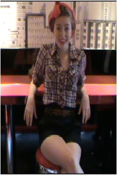
I have kept the theme throughout the digipak and the magazine advert so that they all link together. I started with a background fill and inserted a screen shot of a clip from my music video. I then used the magnetic lasso tool and cut out the background of the photo, turned it back and white,and then moved it back to its original position, leaving the image of me in colour.
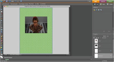
Then I added the 'Connie Francis' title and after that I then added shapes surrounding the picture, because I was influenced by the Seasick Steve poster I analyzed and I feel that the shapes match the writing theme which I have also used on the digipak.
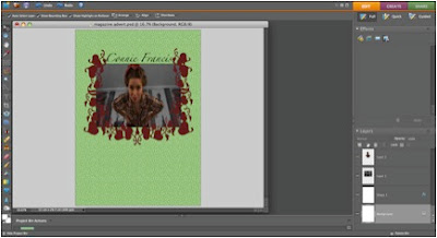
After the shapes, I added hearts along the top just to complete the whole look of the poster and the hearts link with the music video for 'stupid cupid' and the digipak theme. I also added two big hearts at the bottom for any text.
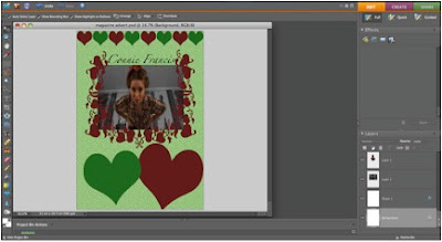
Finally, I added the text into the hearts which advertises the album and 'the new hit track Stupid Cupid'. Telling the readers of the poster that the album is 'out now!'
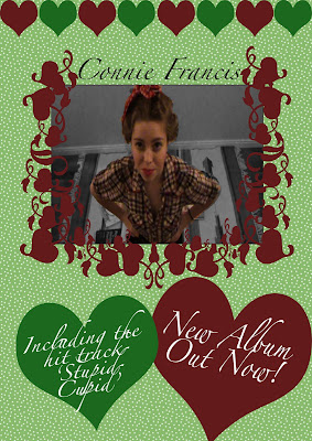

Then I added the 'Connie Francis' title and after that I then added shapes surrounding the picture, because I was influenced by the Seasick Steve poster I analyzed and I feel that the shapes match the writing theme which I have also used on the digipak.

After the shapes, I added hearts along the top just to complete the whole look of the poster and the hearts link with the music video for 'stupid cupid' and the digipak theme. I also added two big hearts at the bottom for any text.

Finally, I added the text into the hearts which advertises the album and 'the new hit track Stupid Cupid'. Telling the readers of the poster that the album is 'out now!'

Sunday, 31 October 2010
Risk Assessment
When Filming I could trip over wires, and for one shot I use garden shears as a prop, these could be highly dangerous so I need to ensure that the floor is clear and everything is tidy and in order. Wires need to be taped down.
When travelling in the car I need to make sure that props and equipment are all secured and that they aren't moving around. I need to take extra precautions with the camera equipment whilst in the ice-cream parlour because of other customers, so I will have to produce some signs pointing out any wires and making sure that equipment is all out of the main walkway.
When travelling in the car I need to make sure that props and equipment are all secured and that they aren't moving around. I need to take extra precautions with the camera equipment whilst in the ice-cream parlour because of other customers, so I will have to produce some signs pointing out any wires and making sure that equipment is all out of the main walkway.
Friday, 22 October 2010
Development of Digipak
FIRST SIDE OF DIGIPAK:
First I measured out the lines to make sure that the digipak was evenly spaced and I added a background colour. Then on the left and right sides I inserted dotted shapes to create the dotty backgrounds.
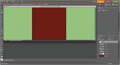
Then I added the text to it, and also inserted text on the part which would be the thin side bit.
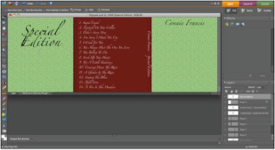
After that I added the images and turned them black and white. With the image on the front, I used the lasso tool to cut out the background and separate it from the bar stool, then I turned that black and white and moved it back in place. I then enhanced the colour of the bar stool.
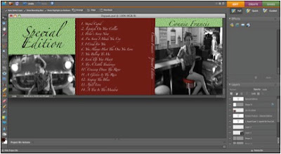
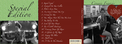
Finally, I added a heart shape for the text about the 'new hit track' and I added an old-style barcode for realism.
SECOND SIDE OF DIGIPAK:
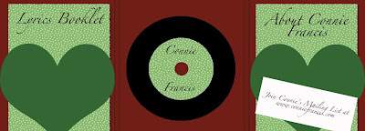
First I added a background colour and two rectangles filled with 'dot print' which represent booklets. Also I added the basic shape of the disc, in black, for record style to compliment the age of the song and for more realism.
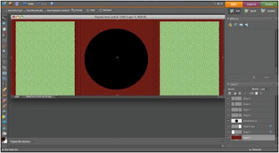
Then I added extras to the basic disc shape and I also added text to the booklets and to the disc.
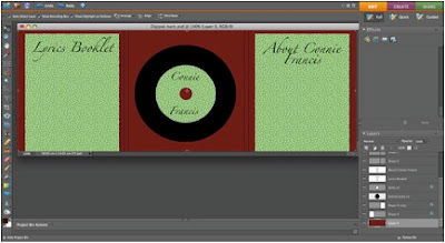
I then added the two heart shapes which would be the holders for the booklets.
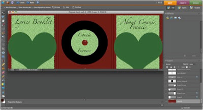
Finally I added a membership slip giving an email address for fans to join a mailing list.
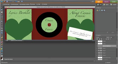
This poster would be included in the digipak:
First I measured out the lines to make sure that the digipak was evenly spaced and I added a background colour. Then on the left and right sides I inserted dotted shapes to create the dotty backgrounds.

Then I added the text to it, and also inserted text on the part which would be the thin side bit.

After that I added the images and turned them black and white. With the image on the front, I used the lasso tool to cut out the background and separate it from the bar stool, then I turned that black and white and moved it back in place. I then enhanced the colour of the bar stool.

Finally, I added a heart shape for the text about the 'new hit track' and I added an old-style barcode for realism.

SECOND SIDE OF DIGIPAK:
First I added a background colour and two rectangles filled with 'dot print' which represent booklets. Also I added the basic shape of the disc, in black, for record style to compliment the age of the song and for more realism.

Then I added extras to the basic disc shape and I also added text to the booklets and to the disc.

I then added the two heart shapes which would be the holders for the booklets.

Finally I added a membership slip giving an email address for fans to join a mailing list.


This poster would be included in the digipak:

Monday, 11 October 2010
Sunday, 26 September 2010
Thursday, 23 September 2010
Organization of Props, Location, Actors, Costumes
Monday, 20 September 2010
Connie Francis - Stupid Cupid. Lyrics Breakdown
Stupid Cupid you're a real mean guy (0.02 - 0.05)
I'd like to clip your wings so you can't fly (0.06 - 0.08)
I'm in love and it's a crying shame (0.09 - 0.12)
And I know that you're the one to blame (0.13 - 0.15)
Hey hey, set me free (0.17 - 0.19)
Stupid Cupid stop picking on me (0.20 - 0.22)
I can't do my homework and I can't think straight (0.23 - 0.26)
I meet him every morning 'bout a half past eight (0.27 - 0.30)
I'm acting like a lovesick fool (0.31 - 0.33)
You've even got me carrying his books to school (0.34 - 0.37)
Hey hey, set me free (0.38 - 0.40)
Stupid Cupid stop picking on me (0.41 - 0.44)
You mixed me up for good right from the very start (0.45 - 0.51)
Hey now, go play Robin Hood with somebody else's heart (0.52 - 0.58)
You got me jumping like a crazy clown (0.59 - 1.01)
And I don't feature what you're putting down (1.02 - 1.05)
Well since I kissed his loving lips of wine (1.06 - 1.08)
The thing that bothers me is that I like it fine (1.09 - 1.12)
Hey hey, set me free (1.13 - 1.15)
Stupid Cupid stop picking on me (1.17 - 1.19)
Instrumental (1.20 - 1.33)
You got me jumping like a crazy clown (1.34 - 1.37)
And I don't feature what you're putting down (1.38 - 1.40)
Well since I kissed his loving lips of wine (1.41 - 1.44)
The thing that bothers me is that I like it fine (1.45 - 1.48)
Hey hey, set me free (1.49 - 1.51)
Stupid Cupid stop picking on me (1.52 - 1.54)
Hey hey, set me free (1.56 - 1.58)
Stupid Cupid stop picking on me (1.59 - 2.01)
Instrumental (2.02 - 2.11)
Tuesday, 14 September 2010
Requesting Artist Permission
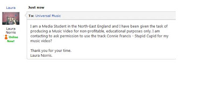
Connie Francis' was with the record label MGM (Metro-Goldwyn-Mayer) however, according to wikipedia, in 1975 Polydor Records bought the MGM label and all the rights too. So I have contacted Polydor Records (owned by Universal Music Group) via their myspace account (http://www.myspace.com/UniversalMusic) and I am awaiting a reply.
Proof of Message:
Proof of Message:

Monday, 13 September 2010
Primary Audience Research
I created a questionnaire and asked 20 random females and 20 random males to fill it in. I then turned these results into pie charts and bar charts for an easier overview of all the results using Microsoft Excel.
Media questionnaire results
View more presentations from AdvancedPortfolio.
Monday, 12 July 2010
Magazine Advertisement Deconstruction - Seasick Steve
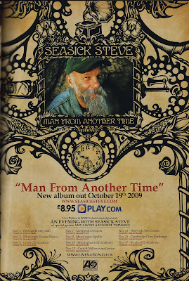
Seasick steve was born in 1941 and writes his own songs which are usually about his earlier, casual life. The style of the poster is appropriate to the title of the album 'Man From Another Time'. The poster has an image of Seasick Steve framed by the black images and has the look of old, discoloured paper with black ink print showing old decoration with the swirls and detail of the black ink images. Also there is a pocket watch, which also links to far back into the past and there is an image of a gramophone which indicates another time when only records existed. Also there is an image of an old telephone linking back to 'another time'.
The font is an old style font which matches the music Seasick Steve creates because his music is old style country and blues. The text and images work together because they are both of the old style, same as Seasick Steve.
We can learn from the poster that the target audience who Seasick steve aims his music at is the older generation and we know in particular guitarists, but there's a lot of evidence that children enjoy his music, but seniors also enjoy his music. Seasick Steve has mastered how to reach to all age groups with his music.
The poster also advertises Seasick Steve's Concerts, providing the date and venue information.
Friday, 9 July 2010
9 Frame Analysis - Lady Gaga, Alejandro.
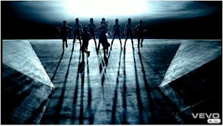
Shot 1 (0.33)- Is setting the scene and all we can see is the silhouettes of people standing on a ramp with bright lights behind them. It may be meant to look like a dark, mysterious place unlike earth, above them in this shot looks like one dark breakthrough in the clouds. The camera is centered and at the same level at the people beginning to descend down the ramp. The lighting is casting long thin shadows of the people and the place is very dark. The figures look mysterious, almost inhuman because of the shape of their head-wear.
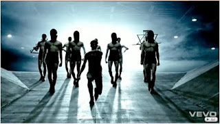
Shot 2 (0.46) - In this frame it almost seems like the people are decent to a world, down the ramp of some UFO, spaceship style technology. The bodies of the peoples are now visible highlighting their toned shape, like their own personal armour. However, their faces are still dark and unrecognizable. We can see now that above them is what looks like metal framework and we can see the surrounding lights. The shot goes into a second of slow-motion, adding to the effect and the drums in the music slow to emphasize these peoples powerful presence.
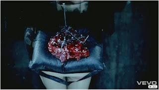
Shot 3 (1.10) - This frame shows Gaga carrying a frozen, broken heart nailed together, and she is carrying it as though worshiping it, on its own little cushion, throne. Its as if the heart has been injured in war, in a battle. The camera is raised, looking down on the heart and the heart is a candy red, whilst the rest of the hot is dim and mostly black and grey, this makes the heart the focus of the shot.
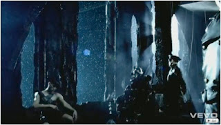
Shot 4 (1.24) - There are men stood with guns to protect Gaga who is sat in a chair surrounded by, looking down on, her army or worshippers. Looking out into the snow, crowds can be heard on the track. Possibly Gaga is being portrayed as a God or ruler. The shot is very dark and the only light is shining through a window far in the shot.
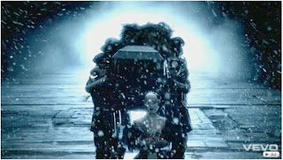
Shot 5 (1.44) - This frame shows soldiers carrying a coffin, whilst Gaga walks in-front with the heart. It could be Gaga's love in the coffin and she is carrying his heart, or it could be Gaga's body in the coffin and she is in the afterlife, carrying her own, broken heart. Also it could be Gaga's 'old' body and she has been reborn, and she is now going to protect her heart from being broken again.
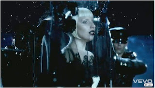
Shot 6 (2.03) - Gaga is making a speech which we hear in the music; 'I know that we are young and I know that you may love me, but I just can't be with you like this anymore, Alejandro.' As she makes this speech she is surrounded by her guards who are protecting her. This speech could mean anything. It seems to mean that her relationship with 'Alejandro' just cannot continue, that its not working out. Maybe he keeps her prisoner, and now she has an army to protect her and her heart against him from now on. The frame again is very dark with Gaga seeming to be the light of the picture. Also the coffin is in the being still being supported by her guards so this frame could also mean that she has killed Alejandro for the greater good, and that she is better off without him now. Or its her speech in her newborn life, maybe she took her own life to escape the one she had with Alejandro.
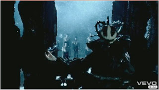
Shot 7 (2.31) - This frame shows Gaga sat in a chair smoking, looking down on what could be her army of slaves, or worshippers standing before her, framed by the arch of rock, or structure of the building. As in previous frames, Gaga is in the darkness and we see from behind her what she is looking at. Maybe the audience are getting a point of view from one of her guards.It is snowing, as it is in most of the video, possibly symbolising a cold, cruel, empty and harsh world. Even brutal as the video shows her army being beat and thrown to the floor.
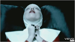
Shot 8 (3.45) - Gaga is seen clutching prayer beads wearing a nuns habit and a wimple, this frame shows the strong religion in this video and Gaga is praying, begging as we hear her ask in the music, 'Stop, Please, Just let me go. Alejandro.' Could Alejandro be keeping her prisoner? Gaga is the light and focus of the video, with the bright white wimple.
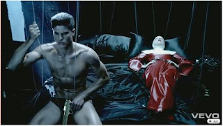
Shot 9 - (8.23) - Gaga is laid on the bed with a man (assumingly Alejandro) sat up with a gun. Has he murdered Gaga? possibly because she didn't want him anymore? We saw in shot 8 that she was praying and begging, maybe she was begging for her life? Or maybe the coffin seen in shot 5 contains Alejandros body, and he has shot himself. Or it could be Gagas old body in the coffin after she has been murdered and she is then in another world, another life. Safe from Alejandro. Either way shot 9 shows an end to some life. Also in this shot, they are on strings like puppets being controlled from someone greater. Maybe Gaga was seen praying in shot 8 to the higher person controlling them, asking the puppet master not to have Alejandro shoot her.
The song contains mexican words and phrases and translated they mean:
Alejandro - Alexander
Roberto - Robert
En Su Bolsillo - In Your Pocket
Tuesday, 29 June 2010
Shot Counts - Christina Aguilera, Candyman.
- There are approximately 254 shots in this video.
- Over 100 meat shots of Christina Aguilera.
- Pace of editing is really quick in the song to match the tempo and the beat.
- Type of shots is very varied including long shots, close-ups, medium close-ups, establishing shots, zoom in, cut zoom in, shot reverse shots.
- The video is illustration, demonstrating the literal meaning of the lyrics and amplification because it retains a link to the song through the beat and cuts and dancing.
Monday, 28 June 2010
Shot Counts - The Saturdays, Just Can't Get Enough.
- There are approximately 291 shots in this video.
- Pace of editing is quite quick in the song because the music is upbeat.
- Type of shots are well varied and include long shots, close-ups, medium close-ups, establishing shots.
- The video is mostly disjuncture because most of the time the lyrics are irrelevant to the video.
- Amplification because the cuts are linked with the beat.
Friday, 25 June 2010
Green Screen
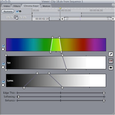
This is the Chroma Keyer which I used to edit out the green screen. I used the colour pick to begin and pick a piece of the green out. Then using this tester of green I dragged out or closed in the colour, saturate and luma to start to edit out the green screen. Also I used the Edge Thin, Softening, and Enhance to change the clip.
Before:
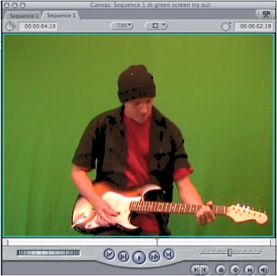
After:
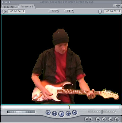
I have found that the green screen editing on final cut is difficult to use and the result is not very good, the edges aren't crisp and the clip is blurry. I do not think that I will be using the green screen in my Music Video because its too difficult to use, it takes too long and I don't think it looks effective.
Thursday, 24 June 2010
Digipak Analysis - Mika, Life in Cartoon Motion.
Link to Digipak analysis for easy viewing:
http://prezi.com/nayd0dwklxoc/digipak-analysis/
The Jimi Hendrix Experience - Axis: Bold as Love.
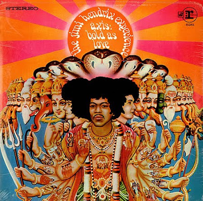
The genre of the music on this album is psychedelic rock, blues rock and hard rock. The album was first released in the UK in December 1967.
This album cover began as a photographed copy of a mass produced religious poster of a Hindu painting where Jimi Hendrix was later painted in. This painting is known as 'Virrat Purushan-Vishnuroopam' which is a term within Hinduism which refers too:
- The Universal form revealed by Krishna in the Bhagavad Gita.
- A name of the deity, Shiva.
- The yoked horses of the Sage, Brhaspati.
- Trisiras the three-headed son of Tvashta.
- One of the seven tongues of fire in reference to the god, Agni.
Krishna in the Bhagavad is often depicted as a boy playing a flute and he is generally show in paintings with blue skin. Looking at the album cover, we can see that at the back of the picture there is a man playing a flute and all around him the colour blue has been picked as the background and this is the man in the poster. Krishna is often shown with a yellow dhoti and a peacock feather crown and on this part of the album cover, we can see that the man is wearing a yellow headpiece. In the performing arts the actor of Krishna is often painted green with black eyebrows and black around the eyes and this colour symbolizes the nature of the character, and looking at the cover we can see one green man on the right hand side and this could definitely be a reference to the performing arts depiction of Krishna.
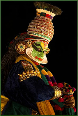
However, Bhagavad Gita is a sacred hindu scripture considered amongst the most important texts in the history of literature and philosophy. The teacher of the Bhagavad Gita is Krishna and it begins before a battle with a Pandava price Arjuna realising that war was inevitable between himself and his relative Kaurava Prince Duryodhana. Both Duryodhana and Arjuna requested Krishna to support them in the war, since he possessed the strongest army, and was revered as the wisest teacher and the greatest yogi. Krishna offered to give his vast army to one of them and to become a charioteer and counselor for the other, but he would not touch any weapon nor participate in the battle in any manner. While Duryodhana chose Krishna's vast army, Arjuna preferred to have Krishna as his charioteer. From then on, they have been painted and even made into famous statues depicted in a chariot together and in the picture below, Arjuna matches the man on the album cover. Most of the characters on the Album cover are holding weapons such as spears and these weapons could be linked to the battle of Kurukshetra.

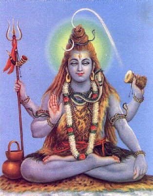
The Deity, Shiva, is seen as a supreme God, one of the five primary forms of God. In images he is generally represented as immersed in deep meditation. Looking at the album cover, Jimi is depicted as a God with many arms, draped in robes and colour. Shiva's particular weapon is the trident.His Trisul that is held in his right hand represents the three Gunas—Sattva, Rajas and Tamas. That is the emblem of sovereignty. He rules the world through these three Gunas.
Shiva is represented in many different forms and a seal discovered one form which I think could be the form represented in the original poster and then on this album cover. This seal, The Pashupati seal, meaing the Lord of animal-like beings, shows a seated figure surrounded by animals. In this particular form Shiva has three faces and on the album cover Jimi is depicted as having three faces and his hair is similar to Shivas, who is often referred to as hair in a Kaparda fashion (hair that is shaggy or curly). Also, Jimi is surrounded by animals on the left and right which are part of the original image.
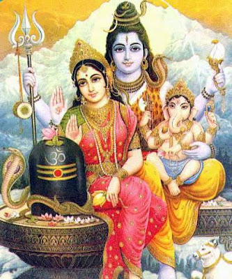
The woman to the right of Shiva/Jimi is, I believe, the goddess Parvati, Shivas wife. Together they symbolise at once both the power of renunciation and asceticism and the blessings of marital felicity. According to Hindu past, Parvati gave birth to Ganesha without any form of participation of Shiva in Ganesha's birth. Parvati ordered Ganesha not to allow anyone to enter her house, and Ganesha obediently followed his mother's orders. After a while Shiva returned and tried to enter the house, Ganesha stopped him. Shiva was infuriated and severed Ganesha's head with his trident. When Parvati saw what had happened, she demanded that Shiva restore Ganesha's life at once. Unfortunately, Shiva's trident was so powerful that it had hurled Ganesha's head so far off that it could not be found. Finally, an elephant's head was attached to Ganesha's body, bringing him back to life. Ganesha is depicted in all images with this elephant head and is on the album cover.
The snakes on the cover, form a canopy over Jimi/Shiva. Snakes are worshipped in Hinduism. It is said the serpent on Shiva’s neck represents the endless cycle of birth and regeneration. Another symbolism is that the snake on his neck represents ego which once controlled can be worn as an ornament. Snakes, especially cobras, are said to carry ‘mani’ (rubies) in their head. It is said that these rubies served as a lamp during the night to Parvati and Shiva. The most famous association of Lord Shiva with snakes is during the churning of the ocean (Samdura Manthanam). Shiva drinks the poison halahala that came out of snake Vasuki, who was used as the rope in the churning. The blue throated Shiva is the result of swallowing the snake poison.
The sunshine and blue background where also added extras to the poster for the album cover.
Sites used in research:
http://en.wikipedia.org/wiki/Axis:_Bold_as_Love
http://www.hindu-blog.com/2007/02/about-snake-around-neck-of-lord-shiva.html
http://en.wikipedia.org/wiki/Shiva
http://en.wikipedia.org/wiki/Parvati
http://en.wikipedia.org/wiki/Bhagavad_Gita
http://www.koausa.org/Gods/God9.html
The Beatles - A Hard Days Night.
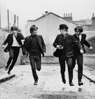
This was the Beatles third UK album, A Hard Day’s Night. It was released on 10th July 1964. I chose to analyse this album cover because I think that it is visually interesting. The Genre of the music on this album is pop rock.
'A Hard Days Night' suggests that they have been either working hard or out all night. The beatles are on the album cover and they are all wearing suits appropriate to the time era. They are laughing whilst running, possibly running from something, or some people, or they've been up to no good or messing about, or if you are aware of the film, then you know they are running from fans and trying to find Ringo etc. The background looks like a rough, working class estate with the fencing on the wall and the road is in need of repair. The album cover is black and white which also fits with the time era and the working class image. Coloured photographs were available in 1964, but only to the richer, upper class who could afford them. Since the image demonstrates working class culture, the black and white could also link to coloured photographs which were unaffordable to the working class. This is a shot taken from the film the Beatles starred in 'A Hard Days Night' which was made in the style of a mock documentary, describing a couple of days in the lives of the group.
Album Covers Analysis
Album Covers I have chosen to analyse:
- The Beatles, A Hard Days Night.
- Jimi Hendrix, Axis: Bold as Love.
- The Beatles, A Hard Days Night.
- Jimi Hendrix, Axis: Bold as Love.
Tuesday, 15 June 2010
Lady Gaga - Bad Romance Video Analysis
Link to Prezi for easy viewing:
http://prezi.com/5pieypumq5pe/
Saturday, 29 May 2010
Friday, 28 May 2010
Lip Sync Task
I used Final Cut to edit the Lip Sync Task. It was simple to use and has overall helped me to understand the software which means that I will be familiar, and more comfortable, with using the software when it comes to creating my own music video.
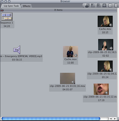
This is the browser window on the Final Cut software. It is where all of the clips and sounds that I filmed go. As you can see above, there is the soundtrack which I used, Paramore - Emergency. I got this soundtrack from www.zamzar.com. I had lots of footage to get through, and a few selections of footage which I used are in the browser box above. It was simple to put the parts of footage into my piece, all I had to do was choose the clips that I wanted and drag them down to the timeline.
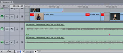
The timeline is made up of layers, the two bottom green strips are where my soundtrack is. I used one of the tools at the bottom left to add the wavelengths onto the strips so that it was easier for me to sync it with the video. The two small red markers show the start of the singing in the song, so that I knew where to start the footage of that particular bit. You can lock each layer whilst editing another strip, by using the padlock tool at the beginning, to the left of each layer. Also you can mute each layer so that you can focus on just one sound part at a time which I found useful when i was using the razor tool to split the video layer.
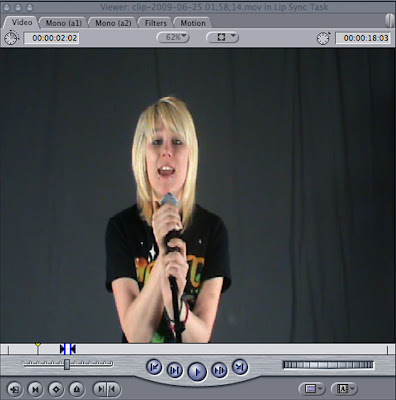
This is the first window where I selected the particular parts of each clip which I wanted to use, I could pick them out by using the in and out markers, which are the two small blue points. Then I just had to drag the selected footage to the timeline. Here, I could also change the motion of the footage whether that be distort, crop, rotation, blur and opacity.
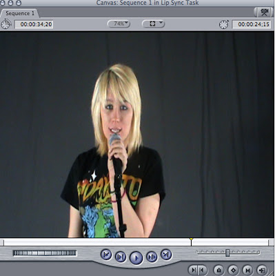
This is the second window where the footage from the timeline is played. I found that here I could also play my footage in slow motion so that I could find any problems with my footage easily enough.
I think that experimenting with Final Cut now, I have gained an advantage when it comes to editing my real music video, as I now have a feel and a better understanding of the software.

This is the browser window on the Final Cut software. It is where all of the clips and sounds that I filmed go. As you can see above, there is the soundtrack which I used, Paramore - Emergency. I got this soundtrack from www.zamzar.com. I had lots of footage to get through, and a few selections of footage which I used are in the browser box above. It was simple to put the parts of footage into my piece, all I had to do was choose the clips that I wanted and drag them down to the timeline.

The timeline is made up of layers, the two bottom green strips are where my soundtrack is. I used one of the tools at the bottom left to add the wavelengths onto the strips so that it was easier for me to sync it with the video. The two small red markers show the start of the singing in the song, so that I knew where to start the footage of that particular bit. You can lock each layer whilst editing another strip, by using the padlock tool at the beginning, to the left of each layer. Also you can mute each layer so that you can focus on just one sound part at a time which I found useful when i was using the razor tool to split the video layer.

This is the first window where I selected the particular parts of each clip which I wanted to use, I could pick them out by using the in and out markers, which are the two small blue points. Then I just had to drag the selected footage to the timeline. Here, I could also change the motion of the footage whether that be distort, crop, rotation, blur and opacity.

This is the second window where the footage from the timeline is played. I found that here I could also play my footage in slow motion so that I could find any problems with my footage easily enough.
I think that experimenting with Final Cut now, I have gained an advantage when it comes to editing my real music video, as I now have a feel and a better understanding of the software.
Thursday, 27 May 2010
Inspiration
I was initially inspired by the OK diner and my original thoughts were to film here, but after looking around I found that Happy Daze was more suitable.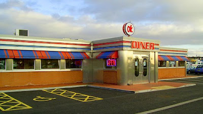
I wanted the persona to have a look of a stereotypical 50's style. Christina Aguilera portrays this well in 'Candy Man' and my characters look is similar, based on this.
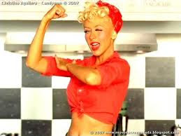

I wanted the persona to have a look of a stereotypical 50's style. Christina Aguilera portrays this well in 'Candy Man' and my characters look is similar, based on this.

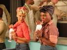
Another clip from 'Candy Man' with milkshakes, which were popular in american diners around the 50's and I hoped to have a milkshake as a prop in the video just for authenticity.
 This 16-frame shows clips from the saturdays comic relief video, and gave me an overall idea of the type of shots include throughout my music video, and I found this video a useful reference because of the old 50's style, similar to the style I wanted to do.
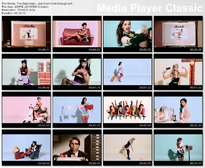
 This 16-frame shows clips from the saturdays comic relief video, and gave me an overall idea of the type of shots include throughout my music video, and I found this video a useful reference because of the old 50's style, similar to the style I wanted to do.
Sunday, 23 May 2010
Research into the history of Rock and Roll.
In 1945, World War II ended. By 1946, American servicemen began returning home to start up the families they had had to put on hold for 4 years. Thus began the unusually large bubble in the population curve of America known as the Baby Boom, as millions of babies were born all of a sudden in the span of five to ten years. What that means is that American society would suddenly find itself catering to a generation of young people in a way that had never occurred before.
Sixties rock finds its roots in several places, starting as far back as the big swing bands of the pre-war era that the 60's kids' parents listened to as youngsters: Glenn Miller, Benny Goodman, Count Basie, Tommy and Jimmy Dorsey, and Duke Ellington's bands are some of the most famous. Except for Duke Ellington, all those bands were primarily dance bands, with big swinging backbeats.
There were also the smaller, "rhythm combo" groups, usually of only four or five players. Their tunes were popular on the jukeboxes of the day, but were not considered artistically important which is why we have mostly forgotten them today.
Then there was Country & Western--especially what was called "Texas Swing," of which Bob Wills & the Texas Playboys was the king. Hank Williams Sr. was another important singer/songwriter of that era and genre.
Over in Memphis there was Sam Phillips and his Sun Studios, where rockabilly and Elvis Presley were born. Besides Presley, Jerry Lee Lewis, Carl Perkins, Johnny Cash and Roy Orbison all began their recording careers at Sun Studios.
Two other sources of modern rock'n'roll, absolutely essential to the sound we think of as 60's rock, were, first, the Blues. Blues began as the music of black sharecroppers in the poor cotton-farming region of the Mississippi Delta, and traveled north to Chicago with the sharecroppers as thousands of them moved north in search of a better life. It was in Chicago that the blues went from acoustic solo guitar music to electric guitar-electric bass-drums combos. Muddy Waters, Little Milton, B.B. King, and Howlin' Wolf were just a few of these important Chicago blues artists.
Source: http://www.spectropop.com/hmadanibrief.html
Saturday, 22 May 2010
The purpose of a Music Video and History Research.
A brief history:
1800s:
When sheet music publishers still ran the music business, Edward B. Marks and Joe Stern hired electrician George Thomas and various performers to promote sales of their song The Little Lost Child. Thomas projected a series of still images on a screen simultaneously with live performances in what became a popular form of entertainment known as the illustrated song. This has been termed the first music video. Even today, many music videos and much contemporary television still use series of still images accompanied by song.
1900s/The Beatles:
One of the earliest performance clips in 1960s pop was the promo film made by The Animals for their breakthrough 1964 hit "House Of The Rising Sun". This high-quality colour clip was filmed in a studio on a specially-built set; it features the group in a lip-synched performance, depicted through an edited sequence of tracking shots, closeups and longshots, as singer Eric Burdon, guitarist Hilton Valentine and bassist Chas Chandler walked around the set in a series of choreographed moves.
Music Videos really broke through since 1964 with the Beatles and the release of their first feature film 'A Hard Days Night' which contains a number of musical sequences which had a huge influence.
The colour promotional clips for "Strawberry Fields Forever" and "Penny Lane", made in early 1967 and directed by Peter Goldman took the promotional film format to a new level. They used techniques borrowed from underground and avant garde film, including reversed film and slow motion, dramatic lighting, unusual camera angles and color filtering added in post-production. Reflecting the fact that these studio masterpieces were impossible for the group to perform live, their psychedelic mini-films illustrated the songs in an artful, impressionistic manner rather than trying to simulate an idealised performance or depict a narrative or plot.
At the end of 1967 the group released their third film, the one hour, made-for-television project Magical Mystery Tour; it was written and directed by the group and first broadcast on the BBC on Boxing Day 1967. Although poorly received at the time for lacking a narrative structure, it showed the group to be accomplished music video makers in their own right. It included elaborate edited sequences for the new songs featured in the film and the clips for "I Am The Walrus" and "Your Mother Should Know" have been screened many times on music TV shows in later years.
1980s:
Music Videos went mainstream. In 1981, the U.S. video channel MTV launched, airing "Video Killed the Radio Star" and beginning an era of 24-hour-a-day music on television. With this new outlet for material, the music video would, by the mid-1980s, grow to play a central role in popular music marketing. Many important acts of this period, most notably Adam and the Ants, Duran Duran and Madonna, owed a great deal of their success to the skillful construction and seductive appeal of their videos.
(THE ABOVE RESEARCH IS TAKEN FROM http://en.wikipedia.org/wiki/Music_video)
The main purpose of a video is to promote the artist and leave the audience remembering the song. However, a music video serves other purposes aimed for by the creators; entertainment.
Quotes for the Music:
'Music is the vernacular of the human soul.'
Author: Geoffrey Latham
'Music is your own experience, your own thoughts, your wisdom. If you don’t live it, it won’t come out of your horn. They teach you there’s a boundary line to music. But, man, there’s no boundary line to art.'
Author: Charlie Parker
'Where words fail, music speaks.'
Author: Hans Christian Anderson
'Joy, sorrow, tears, lamentation, laughter — to all these music gives voice, but in such a way that we are transported from the world of unrest to a world of peace, and see reality in a new way, as if we were sitting by a mountain lake and contemplating hills and woods and clouds in the tranquil and fathomless water.'
Author: Albert Schweitzer
Music Video Quotes:
- 'The visual must be predetermined, but the emotion can't be.'
- 'When you shoot on film. you have to make your choice as you shoot.'
- 'I looked at the rhythms, and I replicated an abstraction, which made my videos closer to what the musicians usually meant in the beginning. I could never be exact in my work, and that was a good thing.'
-'They didn't have to be filled out with fast editing or crazy angles, so that was one of my first rules: Not necessarily to get that nostalgic look, but more to have a commitment to the shot'.
- We'll do a crazy video of a great song that people can actually dance to.'
Friday, 21 May 2010
Warhol Self

To create my Warhol self, I used photoshop. I began with a photo of myself and, using the magnetic lasso tool, I cut around my shape and then copied it onto a new layer, then I blurred the picture and used some tools, including the burn tool, to change the colour, texture and look of my cutout, then I played around with the saturation levels to create the overall finished Warhol-self.
Opie-self
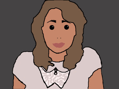
To create my Opie Self I used Photoshop. I started by using a photo of myself and then using the magnetic lasso tool to cut out parts and move them onto a new layer. I started with my hair, then my face and neck, and then my t-shirt. With each piece I used the tester tool to draw a colour from my hair/skin/clothes, then i selected the paint bucket tool and colour filled each piece to create a painted, cartoon effect. After adding a layer for features I finished and then added a background to complete my Opie. I have learnt skills using photoshop which may show useful when starting the editing process of my music video.
Some Photoshop screen grabs to show the software I used to create my Opie-self and Warhol self:
The layers part where I added each section of my photo to colour over, and for my warhol self, to edit the colour and blur etc.
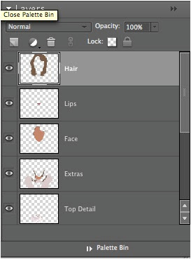
The tool section where I found useful tools such as the magnetic lasso tool and the paint bucket.

Subscribe to:
Comments (Atom)


