First I measured out the lines to make sure that the digipak was evenly spaced and I added a background colour. Then on the left and right sides I inserted dotted shapes to create the dotty backgrounds.
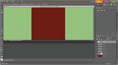
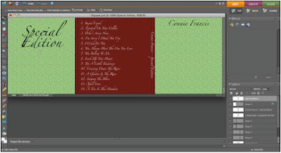
Then I added the text to it, and also inserted text on the part which would be the thin side bit.
After that I added the images and turned them black and white. With the image on the front, I used the lasso tool to cut out the background and separate it from the bar stool, then I turned that black and white and moved it back in place. I then enhanced the colour of the bar stool.
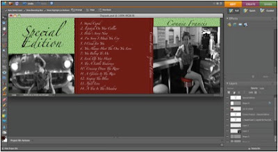
Finally, I added a heart shape for the text about the 'new hit track' and I added an old-style barcode for realism.

SECOND SIDE OF DIGIPAK:
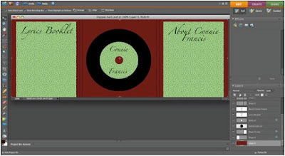
First I added a background colour and two rectangles filled with 'dot print' which represent booklets. Also I added the basic shape of the disc, in black, for record style to compliment the age of the song and for more realism.
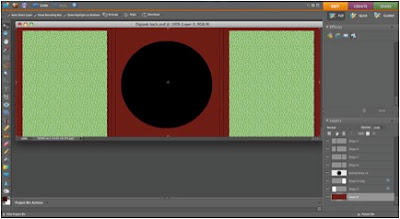
Then I added extras to the basic disc shape and I also added text to the booklets and to the disc.
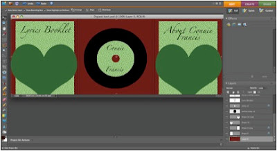
I then added the two heart shapes which would be the holders for the booklets.
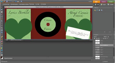
Finally I added a membership slip giving an email address for fans to join a mailing list.

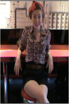
This poster would be included in the digipak:
No comments:
Post a Comment