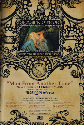
Seasick steve was born in 1941 and writes his own songs which are usually about his earlier, casual life. The style of the poster is appropriate to the title of the album 'Man From Another Time'. The poster has an image of Seasick Steve framed by the black images and has the look of old, discoloured paper with black ink print showing old decoration with the swirls and detail of the black ink images. Also there is a pocket watch, which also links to far back into the past and there is an image of a gramophone which indicates another time when only records existed. Also there is an image of an old telephone linking back to 'another time'.
The font is an old style font which matches the music Seasick Steve creates because his music is old style country and blues. The text and images work together because they are both of the old style, same as Seasick Steve.
We can learn from the poster that the target audience who Seasick steve aims his music at is the older generation and we know in particular guitarists, but there's a lot of evidence that children enjoy his music, but seniors also enjoy his music. Seasick Steve has mastered how to reach to all age groups with his music.
The poster also advertises Seasick Steve's Concerts, providing the date and venue information.
CCNP Training Course In Noida
ReplyDelete