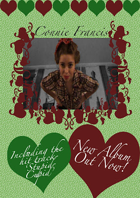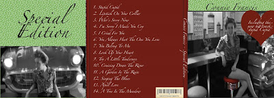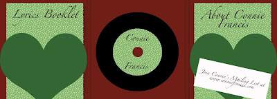


My final three products are linked through colour, style and images. I have used imaged from my footage as pictures on the digipak and advert. For some clips in my video, I edited the colours and added effects to make the colours seem a little off and green/red. This makes my video alike to the advert and digipak. The dot background used on my digipak and advert are of a vintage style and dots were popular, and a pattern of choice in the 50's. I have chosen a swirly font to add to the 50s effect of my products and to keep the theme running throughout. I also added an old barcode onto my digipak for vanity. I was expected to include a 'mailing list link' in my digipak to complete the task, but I am aware that this would not have been an extra in a 50's record. I have made the disc in my digipak look like a vinyl record and I have also included what would be two booklets; One about Connie Francis, and one would be a lyrics booklet.
I have had lots of positive audience feedback on my final cut. From people who watched my rough cut, they have all noted a dramatic improvement from that one to this one. I have so far received one negative criticism about my final cut; 'I don't like the music.' This cannot be helped, and when I was planning my piece, I was aware that it wouldn't be to everybody's taste, but I wanted to do something a little different and the location I found to film really assured me on my decision. I have thoroughly enjoyed making this music video, even though it has been a challenge. I have had a few struggles and let downs when depending on other people and locations, but I kept at it and done it all by myself, from filming to editing.
No comments:
Post a Comment